Client:
DM Allen Electrical
Website:
https://dmallenelectrical.uk
Sector:
Electrical Service Provider
Full Case Study
Challenge
The client needed a professional website that reflected their experience, reliability, and service excellence in the electrical industry. Their existing online presence lacked clarity, strong visuals, and an effective structure to showcase services, testimonials, and completed projects, making it difficult to convert visitors into leads.
Solution
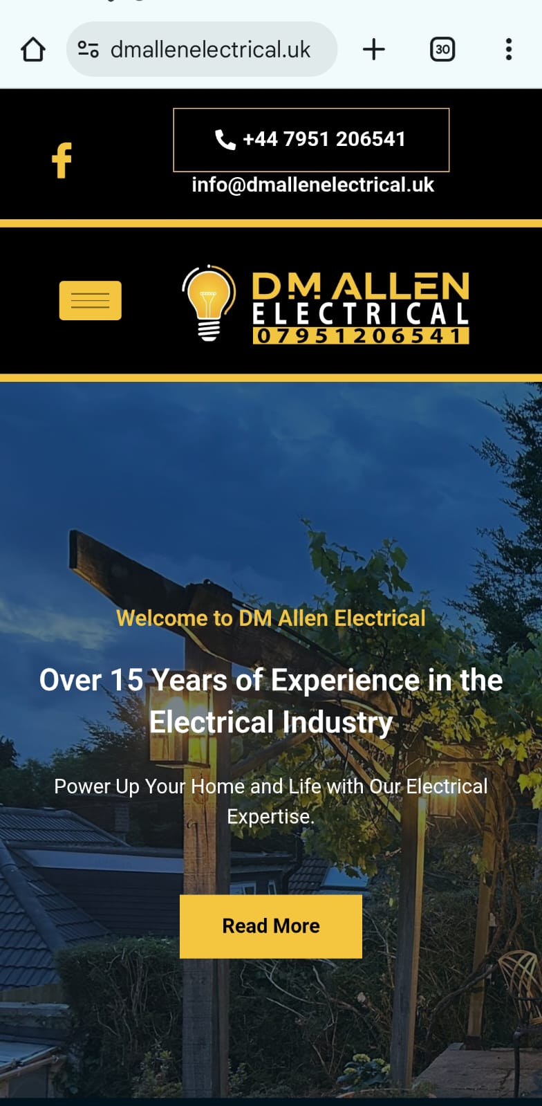
Logo & Branding: Created a clean, modern brand identity that conveys trust, expertise, and technical precision — aligned with the company’s reputation for dependable service.
Website Development: Designed and developed a responsive WordPress website with a professional, minimal layout and clear visual hierarchy. The design emphasizes usability, mobile responsiveness, and smooth navigation to help clients quickly find services, view projects, and request quotes with ease.
Content & Structure: Developed concise, professional content focused on reliability, safety, and customer satisfaction. The site structure highlights the company’s key strengths through dedicated sections for Services, Project Gallery, Testimonials, and FAQs, building transparency and trust. Strong calls-to-action were strategically placed to encourage quote requests and inquiries while ensuring a seamless user experience.
Result
The new website successfully established DM Allen Electrical’s digital credibility, positioning the company as a dependable and experienced service provider in its field. With improved content flow, professional visuals, and a modern design, the site enhanced user engagement, increased quote requests, and strengthened the company’s online reputation. The refreshed digital presence now reflects DM Allen Electrical’s values of quality, safety, and customer satisfaction — helping attract both new residential and commercial clients.
Ideas Behind the Design
The design balances professionalism with simplicity, helping the website convey trust, experience, and reliability immediately. A clean layout uses structured grids and subtle contrasts to reflect precision and technical expertise. Blue and gray tones symbolize safety, stability, and confidence, reinforcing the brand identity. Bold icons and service imagery highlight practical strengths and make key services easy to understand. Clear typography and consistent spacing ensure strong readability across all devices. The overall aesthetic helps visitors feel assured, informed, and ready to connect.
Typography
We used a clean, confident sans-serif typeface to communicate professionalism while staying friendly and modern.
Design
The layout is bold yet minimal — structured to reflect energy and clarity, with user flow tailored for quick access to key info.
Colours
Deep charcoal for strength and focus
Vibrant, Optimistic yellow


Click on image to view our latest website design live!